Layout groups can be configured in the form components configuration dialog. This chapter discusses the configuration options for layout groups, for more information on layout groups, see the corresponding help topic.
You can create a layout group from selected form components with the Create Horizontal Group and Create Vertical Group actions. The new group will be inserted in place of the selected elements.
You can dissolve a group with the Dissolve Group action. This action is only enabled if the selection consists of a single layout group. The elements contained in the group will be inserted in place of the group. Nested groups will not be dissolved.
Grouping features
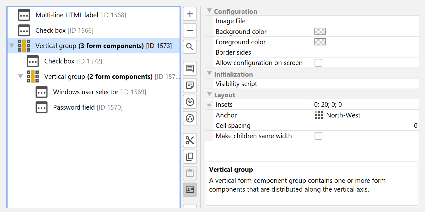
Form components can be grouped in horizontal and vertical layout groups, and you can nest groups to an arbitrary depth.
Grouping offers the following benefits:
-
Custom layout
Instead of a simple sequence of form components on a form screen, you can use horizontal layout groups to put form components side-by-side. Nesting vertical and horizontal form components allows you to achieve virtually any layout.
Sometimes, enclosing groups and sibling groups create a cell that cannot be entirely filled by a layout group. With the "Anchor" property you determine where the group should be placed in that case. By default, horizontal layout groups are anchored at "West" and vertical layout groups are anchored at "North-West".
Layout groups have a configurable cell spacing. For vertical layout groups, this is the vertical gap between two form components (0 pixels by default), for horizontal layout groups this is the horizontal gap between two adjacent form components (5 pixels by default)
For each layout group, you can specify insets that are inserted around the entire layout group. By default, the insets are zero in all directions.
By default, a horizontal layout group aligns a leading label of its first form component with the leading label of the first form component from a direct vertical parent group. This is usually appropriate when horizontal groups are used to attach additional form components to the right side. If this alignment is not desired, you can use the "Align first label" property of a horizontal layout group to switch off the alignment.
Vertical layout groups always break the alignment of leading labels: Within a vertical group, leading labels are aligned, but between vertical groups, the width of leading labels is unrelated.
-
Organization
If you have many form components on a screen, vertical groups emphasize which form components belong together. You can add a common comment to the group. -
Common visibility script
Groups have a "Visibility script" property that allows you to hide the entire group with a common condition instead of having to repeat the condition for each contained form component. -
Single target for coupled form components
If a set of form components should be coupled to the selection state of a checkbox or a single radio button, you can select the containing layout group as the target instead of selecting all coupled form components separately. -
Styling
Layout groups have properties for setting background images and borders, as well as background and foreground colors. Styles use layout groups to achieve visual effects.
Properties of layout groups
Common properties of horizontal and vertical layout groups are:
-
anchor [Configuration]
anchor -
backgroundColor [Configuration]
backgroundColor -
borderColor [Configuration]
borderColor -
borderSides [Configuration]
borderSides -
borderTitle [Configuration]
borderTitle -
borderWidth [Configuration]
borderWidth -
cellSpacing [Configuration]
cellSpacing -
context [Configuration]
context -
enabled [Configuration]
enabled -
foregroundColor [Configuration]
foregroundColor -
formEnvironment [Configuration]
formEnvironment -
id [Configuration]
id -
imageAnchor [Configuration]
imageAnchor -
imageEdgeAxisType [Configuration]
imageEdgeAxisType -
imageEdgeBackgroundColor [Configuration]
imageEdgeBackgroundColor -
imageEdgeBorder [Configuration]
imageEdgeBorder -
imageEdgeBorderColor [Configuration]
imageEdgeBorderColor -
imageEdgeBorderWidth [Configuration]
imageEdgeBorderWidth -
imageFile [Configuration]
imageFile -
imageInsets [Configuration]
imageInsets -
imageOverlap [Configuration]
imageOverlap -
insets [Configuration]
insets -
visibilityScript [Configuration]
visibilityScript -
visible [Configuration]
visible
Vertical layout groups have the additional properties:
-
Make children same width [Layout]
If all contained elements should have the same width.
and horizontal layout groups have the following specific properties:
-
Align first label [Layout]
If the horizontal group is directly added to a vertical group or to the top-level of a form, the leading label in the horizontal group is aligned with other leading labels in the vertical parent group. If this alignment is not desired, you can deselect this property. -
Make children same height [Layout]
If all contained elements should have the same height.
Tabbed panes
In addition to horizontal and vertical layout groups, you can add tabbed panes to a form. A tabbed pane is added by choosing Tabbed Panes→Add Tabbed Pane from the dropdown menu displayed by the Add button. Below the tabbed pane, you have to add one or more single tabs by choosing Tabbed Panes→Add Single Tab For Tabbed Pane. Each single tab can then contain arbitrary form components or layout groups.