Form components are configurable units that can be added to a form screen.
In this chapter, the functionality and configuration options of the form components dialog
are discussed. The underlying concepts are discussed in a
different help topic.
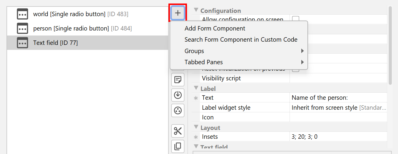
Form elements are added by clicking the
Add button.
In the popup window you can select whether to add
a form component. Form components are made available by install4j or are contributed by
an installed extension.
A registry dialog will be shown where you can select the desired form component.
a form component that is contained in your custom code. New types of reusable
form components can be developed with the install4j API.
In your
custom code configuration you can specify code locations that
are scanned for suitable classes. A class selector will be shown where you can select the desired class.
a layout group, either a vertical
group or a horizontal group. The new layout group is initially empty.
You can also create layout groups directly from a selection in the tree of installer elements.
You can preview a form screen with the
Preview button which is
also available on the property page of a screen. For screens that embed forms, the preview may not show the
actual screen. However, the layout of the form itself will be the same at runtime.
Properties of form components
Common properties of form components are:
Insets [Layout]
This insets around the form component. The format is top;left;bottom;right, use the drop-down button at the right side to show the insets editor.
Initialization script [Initialization]
A script that initializes the form component. To configure the contained principal component, such as a JCheckBox, use the configurationObject parameter (if available). This script will run after the internal initialization of the form component, just before the component appears on the screen. It will not be invoked in console mode.
Reset initialization on previous [Initialization]
If set, the component will be initialized each time the user enters in the forward direction. Otherwise, the initialization will be performed only once. This setting affects both the internal initialization and the initialization script.
Visibility script [Initialization]
A script that determines whether the form component will be visible or not. This works for both GUI and console modes. In GUI mode, the script will be invoked each time just before the form component is initialized.
Available form components
The following standard form components are available in install4j:
Category: Action components
Button
A standard button with an optional leading label. When the user clicks on the button, an action script is executed.
Dark mode switcher
A button that switches between dark and light mode. If the current look and feel does not support switching between dark and light mode, the button is invisible.
Hyperlink URL label
A label that displays a hyperlink. When the user clicks on the hyperlink, the appropriate action is performed, depending on the protocol of the URL.
Hyperlink action label
A label that displays a hyperlink. When the user clicks on the hyperlink, an action script is executed
Category: Labels and spacers
Horizontal separator
A horizontal separator with an optional label.
Key value pair label
A pair of labels. The first ('key') label aligns with other leading labels on the form, the second ('value') label consumes the remaining horizontal space,
Label
A single label. It is left-aligned with leading labels from other form components and extends beyond other leading labels.
Leading label
A form component that only has a leading label and no central component. This can also be used to create standalone help tooltips.
Multi-line HTML label
A multi-line label that wraps text as needed and displays simple HTML. In particular, you can include HTML links that open a browser.
Multi-line label
A multi-line label that wraps text as needed.
Spring
An invisible spring that can be used in horizontal and vertical layout groups to push subsequent components to the right or to the bottom
Vertical spacer
An invisible vertical spacer of configurable height.
Category: Option selectors
Check box
A check box with an optional leading label. The user selection (Boolean.TRUE or Boolean.FALSE) is saved to a variable.
Combo box
A combo box with an optional leading label. The user can enter arbitrary text into the combo box. The user selection (the selected item as a string) is saved to a variable.
Drop-down list
A drop-down list with an optional leading label. The user selection (the selected index as a java.lang.Integer) is saved to a variable.
List
A list with an optional leading label. The user selection (the selected indices) is saved to a variable.
Radio button group
A number of radio buttons in a common button group with an optional leading label. The user selection (the selected index as a java.lang.Integer) is saved to a variable.
Single radio button
A single radio button with an optional leading label. If selected, a specified string is saved to a variable. If you place multiple instances of this form component on a form screen and give them the same variable name, they will form a radio button group.
Category: Sliders and spinners
Slider
A slider with an optional leading label. The user input (a java.lang.Integer) is saved to a variable.
Spinner of dates
A spinner with date and time values with an optional leading label. The user input is saved to a variable.
Spinner of enumerated values
A spinner with enumerated values with an optional leading label. The user input is saved to a variable.
Spinner of integer values
A spinner with integer values with an optional leading label. The user input is saved to a variable.
Category: Special selectors and displays
Directory chooser
A directory chooser with an optional leading label. The user selection is saved to a variable.
File associations selector
A form component that displays a list of all subsequent file association actions and asks the user which associations should be made. This form component will be empty if there are no corresponding file association actions after this screen.
File chooser
A file chooser with an optional leading label. The user selection is saved to a variable.
HTML or text display
A scroll panel that displays HTML or plain text. The HTML or plain text is easily localizable because the file selection allows you to enter separate files for all supported languages.
Installation components selector
A form component that displays all installation components and asks the user which components should be installed.
Installation directory chooser
An installation directory chooser with an optional display of required and free space. The user selection is set as the installation directory.
Installation scope chooser
A pair of radio buttons offering the user a choice whether to install to a user-specific location or whether to install for all users. The initial selection depends on the "sys.installForAllUsers" variable. Because user-specific installations do not require elevated privileges, that variable is set to false by default unless the installation directory is set to a non-writable directory due to an update installation or with the -dir parameter on the command line.
When user clicks Next, the "sys.installForAllUsers" variable is updated according to the user selection. It can be used by the "Set installation directory" action with its "Installation scope" property set to "According to the sys.installForAllUsers variable" to adjust the installation directory
License agreement
A form component that displays a license agreement to the user, either plain text or HTML. The license agreement must be accepted before the next screen can be shown.
Log file viewer
A text area that shows the contents of a text file. The viewer follows additions to the file like the UNIX command tail -f, with a configurable maximum number of displayed lines.
The log file does not have to exist when the form is shown, it can be created later on. Also, the file can be deleted and re-created. Modifications before the previously observed end of the file will not be picked up by the viewer unless the length of the file decreases.
PDF display
Displays a PDF file in an embedded cross-platform PDF viewer.
Program group selector
A form component that allows the user to select a program group on Microsoft Windows.
Progress display
An progress display that can show the progress of the actions attached to the containing screen.
Streamlined installation chooser
A pair of radio buttons offering the user a choice whether to perform a streamlined installation with default settings or to customize the installation. If the installation should be streamlined, the installer variable sys.streamlinedInstallation is set to true. Several standard screens use that installer variable in their default condition expression.
The "Streamlined installation strategy" property offers an alternative mode where the streamlining is only offered for update installations.
Update schedule selector
Drop-down box that lets the user select an update schedule for your application. You can use the com.install4j.api.update.UpdateScheduleRegistry class in your application to check if you should launch an updater. Please see the Javadoc for more information. Please note that simply adding this form component does not automatically launch an updater at regular intervals.
Windows user selector
A component for selecting Windows users or groups in the native Windows user dialog. Optionally, you can display a button to create a new user. The selection is saved as a SID to a string variable. If multiple selection is enabled, the result is a string array of SIDs.
This component does not do anything in console mode, since it requires the native Windows dialog for selecting users and groups.
Category: Text fields
Password field
A password text field with an optional leading label. The user input is displayed with '*' characters. The user input is saved to a variable.
Text area
A text area with an optional leading label. The user input is saved to a variable.
Text field
A text field with an optional leading label. The user input is saved to a variable.
Text field with date format
A text field with an optional leading label and a date format. The user input (a java.util.Date) is saved to a variable.
Text field with format mask
A text field with an optional leading label and an arbitrary format mask. The user input is saved to a variable. The default mask is that of an SSN. For more information, please see the javadoc of javax.swing.text.MaskFormatter.
Text field with integer format
A text field with an optional leading label and an integer format. The user input is saved to a variable with type java.lang.Long.
Text file editor
A text area for editing a file. If the file does not exist, a configurable initial text is presented to the user and the file is created. The file is saved when the user clicks on the "Next" button.
Console handler
Allows you to interact with the user in a console installer. All standard form components expose appropriate behavior in console mode, however, there are situations where you need to fine-tune your console installer with additional messages or questions. In GUI or unattended mode, this form component does not have any effect.