The event browser shows all data that has been recorded in a JFR snapshot.
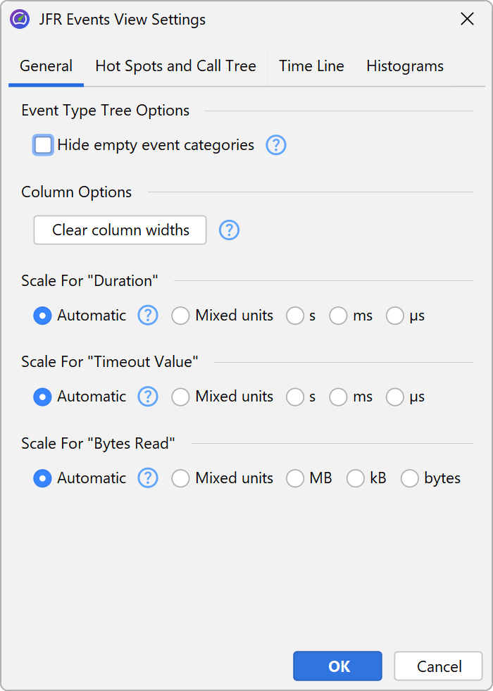
JFR organizes event types into hierarchical categories that make up the tree on the left side of the event browser. You can select a single event type to show the recorded events. By default, JProfiler shows all registered event types, even if no events were recorded for them. Alternatively, you can choose to hide empty event categories in the view settings dialog.
JFR events
Events are shown as rows in the main table with the columns depending on the selection in the tree of event types.
The events in the table are sorted chronologically by default. To avoid overloading the UI, only the first 10000 events are shown in the table. The analyses at the bottom are always calculated from all events. If you set a filter, it will also check all events, not just the first 10000. This means that when setting a filter, events may show up in the table that were previously not displayed.
You can also select multiple event types or entire categories. In that case, the union of all selected events is shown in the table. Because each event type has its own set of columns, only those columns that are common to all selected event types will be included.
The number of available analyses may also be reduced because analysis views are added based on the available columns.
Column widths are adjusted automatically based on their actual content until you resize a column. Then, the width of columns with the same content type will be fixed to your selection and will not change automatically anymore until you clear the column widths in the view settings dialog. Scales in columns with units like time or memory are also calculated automatically for each cell. If you prefer to fix the scale of a column for better comparability, the view settings dialog offers an option for each such column. In this case, the setting is persisted separately for each selected event type.
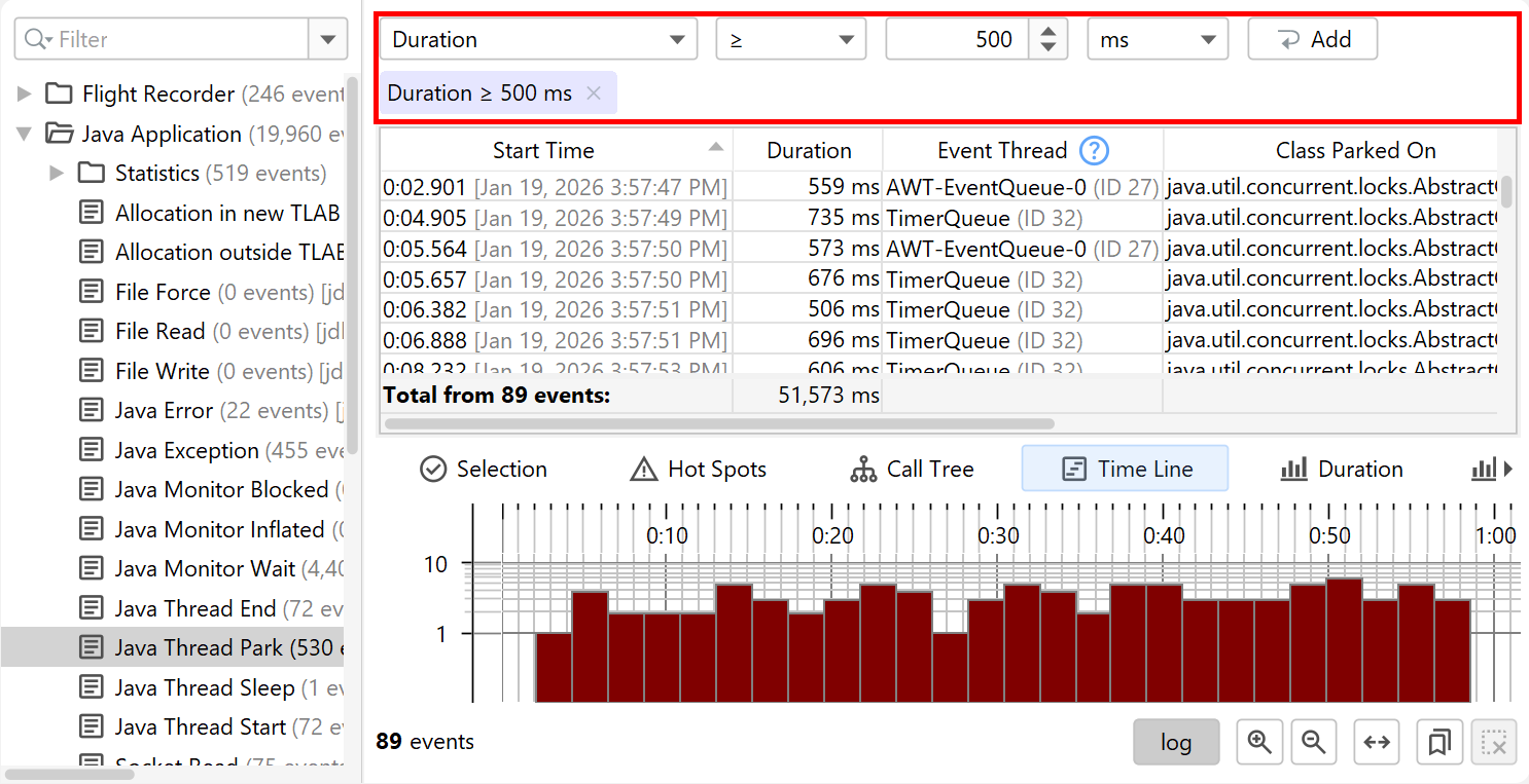
There are several ways to filter events. At the top of the table, there is a filter selector that allows you to filter in all text columns or to select a single column and configure a filter that matches the column type.
Another way to filter is to select a row of interest and use the context menu to select a specific filter based on the values in the selected row. The filter selector at the top will be adjusted, so that it displays your selection. You can now choose another value and add the filter again, it will then replace the previous filter for the same column. In general, each filter type can only be present once and setting the same filter again will replace the previous filter.
Stack traces
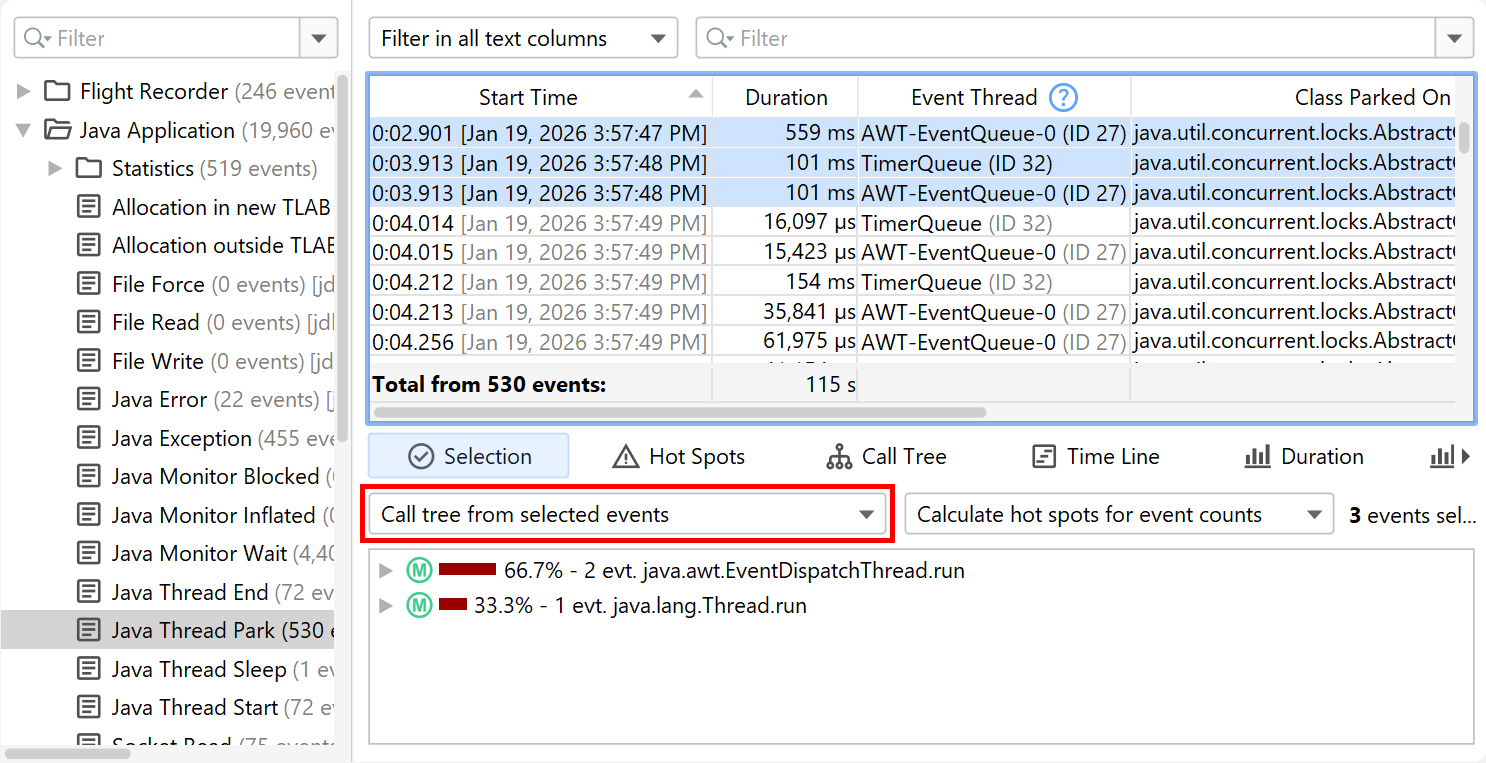
In JProfiler, the stack trace of a selected event is visible in the "Selection" tab of the split pane below the event table.
If you select multiple events, the selection tab changes to a view that shows you either the hot spots or the cumulated call tree calculated from the stack traces of the selected events.
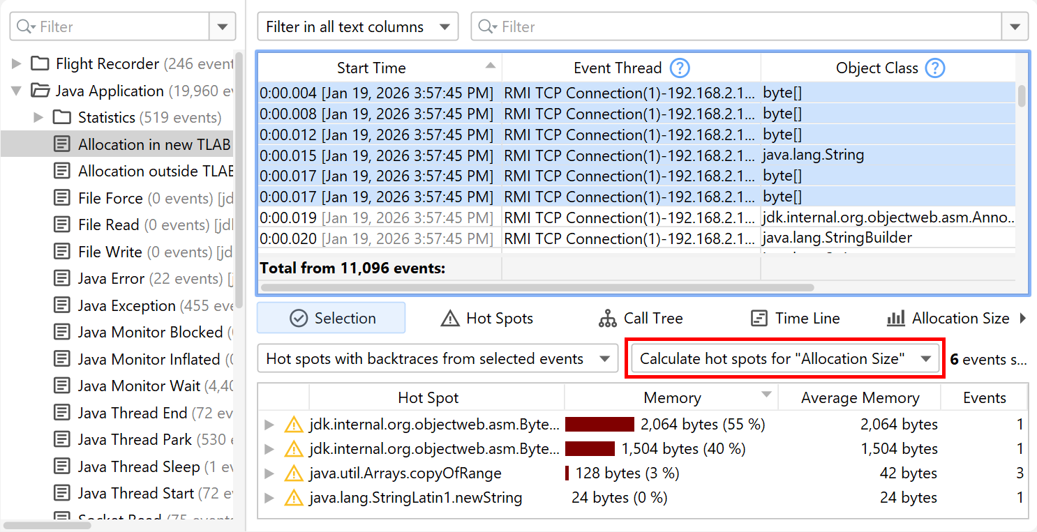
By default, event counts determine the percentages on the nodes in the call tree and hot spots views. Some event types include other measurements that are suitable for this purpose, such as a duration or allocated memory. If such measurements are available, you can select them as the hot spot type from the second drop down in the selection tab.
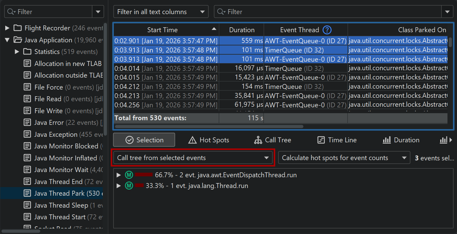
The "Hot spots" and the "Call tree" views in the lower split pane contain the same views, however, they are calculated for all events in the snapshot. Similar to the selection tab, they also have a "hot spot type" drop down. In addition to showing all events, you can also select a filter from these views. In the call tree view, selecting a particular call stack and clicking on the Filter selected button will only show events with that call stack in the table above. For the hot spots view, you can either select the hot spot at the top level or any node in the back trace, so that only events will be shown whose stack trace ends with the inverted call stack fragment to the selected node.
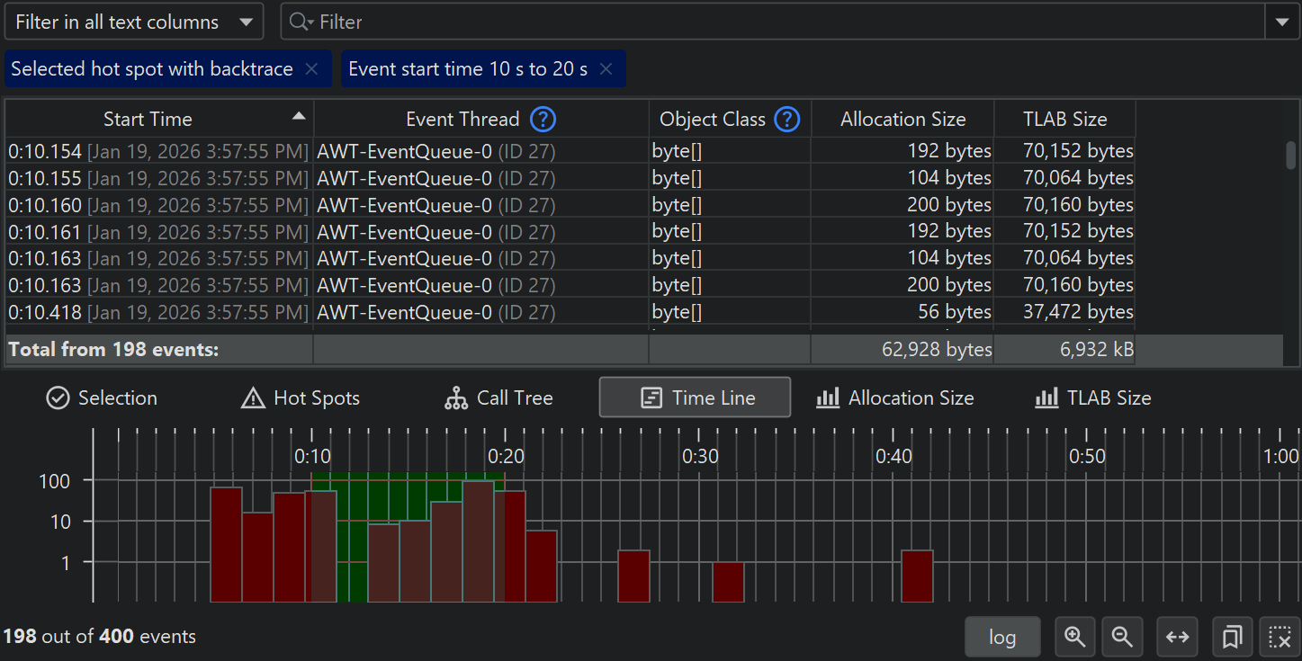
In the screenshot above, you can see that a node in the backtrace was selected as the filter node. In addition to the regular call tree icon, it also includes a check mark. You can remove filters with the tag label at the top or via the Remove filter button. The event count in the table is equal to the number on the selected node. The hot spot tree still shows all events without the filter that was set in the hot spot view.
This is a general feature of filters that are set from the analysis views: The analysis view itself is calculated from all filtered events, but excluding the filter that was set in the analysis view. This makes the analysis view more useful because you can see what part of the total event set you have selected there.
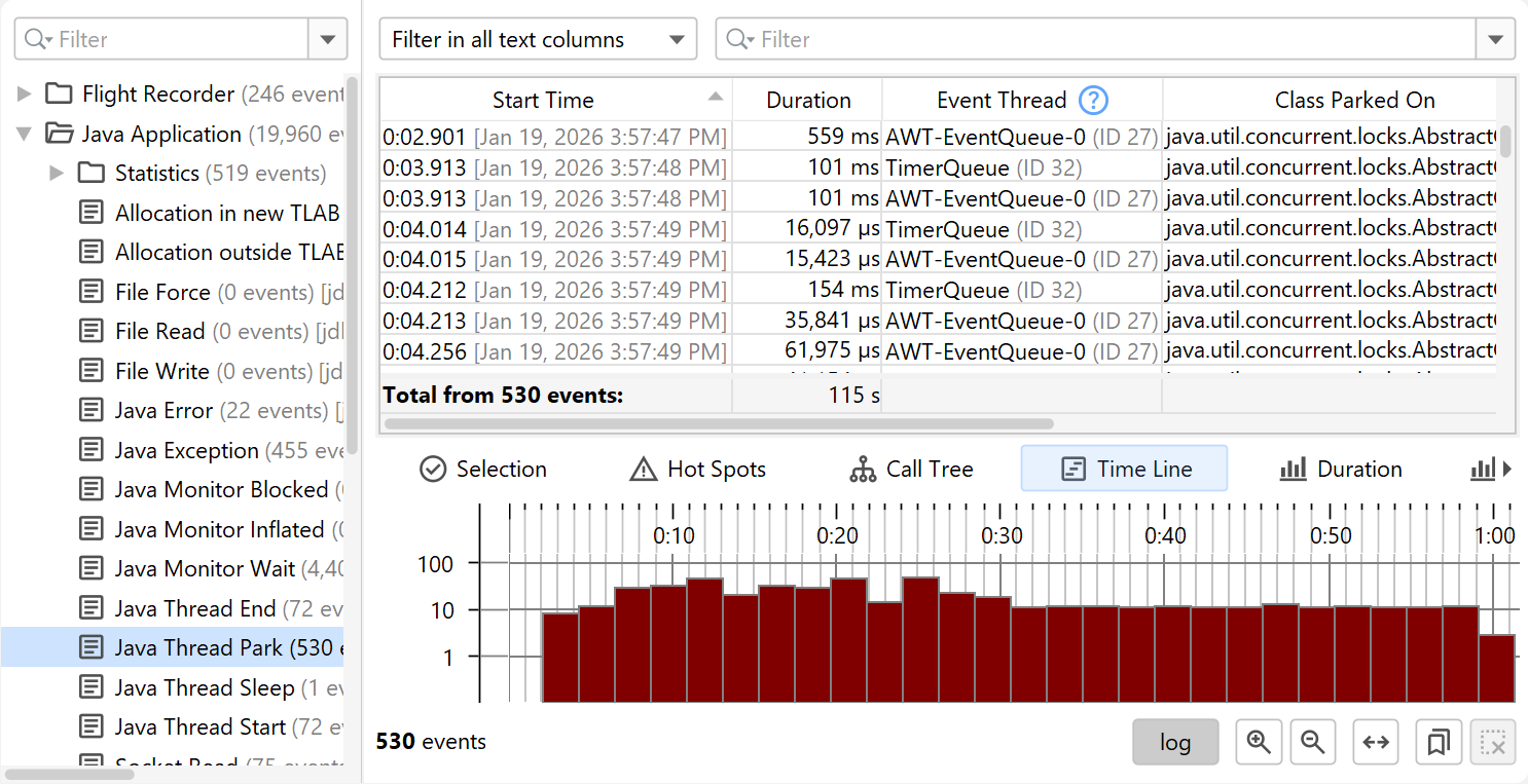
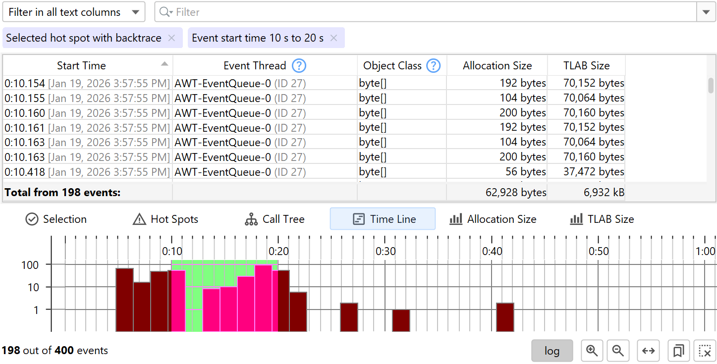
Time line view
All JFR events have associated times, so every event type or set of event types has a time line view that shows the chronological distribution of events.
To focus on a particular time range, you can drag along the time axis. In the above example, we now have two filters: A filter from the backtrace of a hot spot and the filter from the timeline view. Again, the time line view continues to show the entire time range while other analysis views will now only show events from the selected time range.
The default display mode is logarithmic, so that regions of low event counts are still visible against regions of high event counts. You can switch to linear mode by deselecting the log button below the time line. By default, the entire time range is shown in the available width, but you can switch to a variable time range and zoom and scroll just like in the other telemetries in JProfiler. Also available are bookmarks where you can add a vertical marker at selected time ranges. In that way, you can compare moments in time across different event types.
Histogram views
All measurements that can be summed for multiple events, such as durations and allocation sizes, are treated in a special way: First, the columns of these measurements in the event table have a total value at the bottom. Second, the call tree and hot spot analysis views offer a "hot spot type" drop-down to calculate their trees with these measurements instead of event counts. Finally, for each such measurement, a histogram analysis is added to the lower split panel.
Histograms show event counts on their vertical axis while the horizontal axis shows the selected measurement and is divided into a number of bins, so that a distribution can be calculated. Bin sizes and event counts are available from the tooltip.
The screenshot above shows how a filter has been set in the histogram. Just like for other analysis views, the filter only applies to other analysis views, and the entire histogram is still shown. As for the timeline view, the histogram has a logarithmic vertical axis by default. Here, the selected events in the screenshot would not be visible with a linear axis.