install4j 7.0 introduces the following notable new features:
install4j 7 adds full support for Java 9. Java 9 JREs are now found by the JRE search sequence
and can be used to run installers and launchers. If you use
jlink to prepare your custom JRE,
only the "java.desktop" module is required for running installers and installer applications.
Some actions require other modules, depending on their functionality. For example, the JDBC actions
require the "java.sql" module.
Java 9 JRE bundles are also supported and we have added an EA build to the
JREs that can be downloaded from within the install4j JRE. You can use the JRE bundle creation wizard to
create bundles from new builds as they become available.
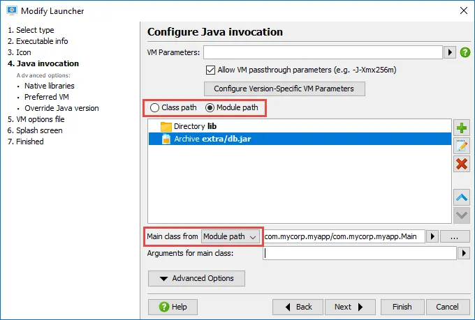
The module path for Java 9 applications can now be configured for launchers. Both module path and class path
can be defined side by side, the main class can be selected either from the class path or from the module path.
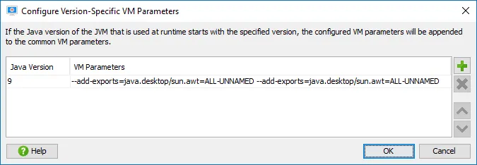
With Java 9, many applications need a number of command line parameters that are not recognized
by earlier Java versions. If you plan to support Java 9 and Java 8 at the same time, the
"Version-specific" VM parameters come in handy.
Java 9 adds support for HiDPI on Windows and Linux. Retina displays on macOS were already supported
by earlier versions of install4j. With Java 9+ as a minimum version, installers and installer applications now
run with DPI-awareness enabled and show high-resolution images.
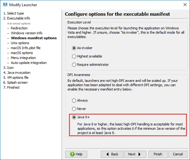
For Windows, install4j already had an option to make launchers DPI-aware, the new default option "Java 9+" now
enables DPI-awareness if the minimum Java version is at least 9.
If you have configured a splash screen for your launcher, and a high-resolution version of the image is
available, that image is now also used for the splash screen on Windows and Linux if the DPI value requires it.
Background auto-update functionality has been added to install4j. You can activate it in your project
with three simple steps:
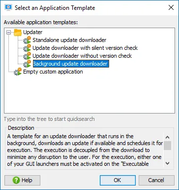
Step 1: Add a new installer application from the "background update downloader" template.
That installer application downloads an update if available and schedules it for execution.
In contrast to the traditional update downloader templates it does not execute the installer immediately,
but splits download and execution into two phases in order to make updates less disruptive for your users.
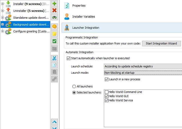
Step 2: To start the background updater, use its launcher integration and set the launch mode to
"Non-blocking at startup". The background updater does not have a UI and will complete a download even if your
application is shut down.
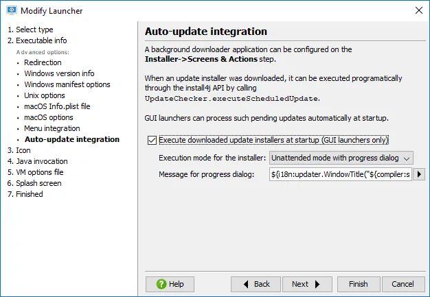
Step 3: In the launcher wizard of a GUI launcher that should process scheduled update installers,
go to the new "Auto-update integration" step and select the "Execute downloaded update installers at startup"
check box. By default, the execution mode is set to "Unattended mode with progress dialog".
For services and command line launchers, the
UpdateChecker
API allows you to
execute scheduled update installers programmatically.
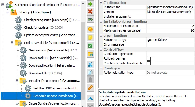
At the heart of the background update downloader is the new "Schedule update installation" action.
It can set arguments for the installer with its "Installer arguments" property and has additional properties to
configure error handling. To avoid looping execution in case of an error, a failed installation is retried
at most once per day.
You can take more control over the auto-update process if you use the API. The HelloGui class
in the "hello" sample project shows how to do everything with the API and without launcher integration
or auto-update integration in the launchers.
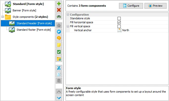
install4j 7 introduces flexible styling of installers and installer applications. On the new
"Installer → Styles" step you configure styles that can be assigned to installer applications,
screen groups or single screens.
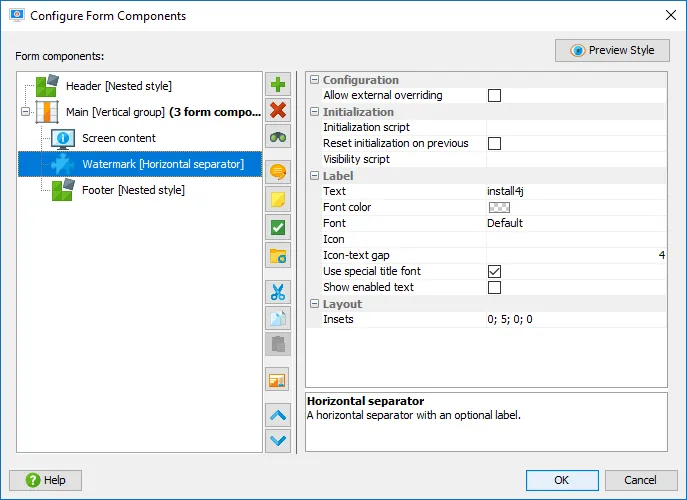
Styles are configured like form screens, with a limited selection of form components that do not take any user
input. Horizontal and vertical form component groups are used for layouting.
In addition, a special set of style components is available for capturing content and executing
navigation logic in screens:
- The "Screen content" style component displays the content of the current screen
- The "Screen title" style component is a label that displays the title or the subtitle of the current screen
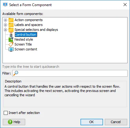
- The "Control button" style component is a button that is associated with a navigation action, one of "Next", "Previous" or "Cancel"
- The "Nested style" component embeds another style
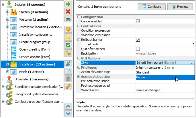
Styles that have their "Standalone style" property selected can be chosen in the "Style" property of
installer applications, screen groups or screens. Installer applications have a default value of
"Default" for that property and use the style that has been marked as the default style.
Screen groups and screens have a default value of "Inherit from parent", so style changes are recursive
by default.
install4j 7 comes with two styles that exactly match the default styles in previous versions of install4j.
Some properties of these styles can be overridden when the style is applied to a particular element.
The "Standard" style has a configurable header image and configurable background and foreground colors.
The "Banner" style has a configurable sidebar image and background color. This matches the previously
configurable properties and ensures a seamless migration of settings from older projects.
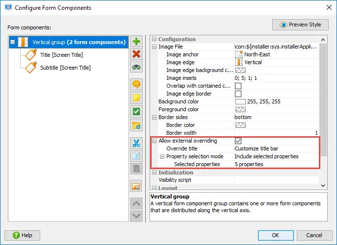
The overridable elements are not hard-coded but can be configured by yourself in the configuration of the
style. Each style component has an "Allow external overriding" property. If you select it, the
"Override title" child property must be set to a text that is unique for the entire style. Also, you can choose
the properties that should be overridable. When you select the containing style for an installer application,
screen group or screen, check box properties for each overridable style component are shown as child properties.
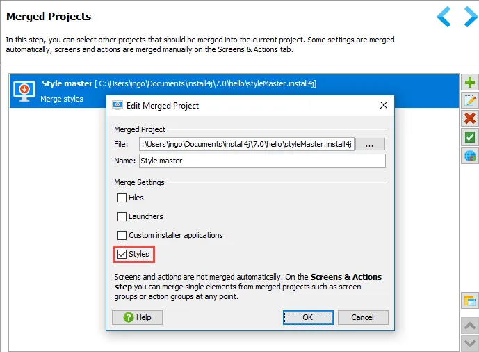
Styles can be merged from other projects. This allows you to share a common style with multiple installers.
To enable style merging, select the "Style" check box in the configuration of a merged project.
If style merging is not enabled, styles with the same name are used from the main project when you
link to screens from other projects.
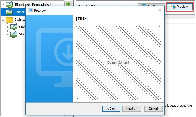
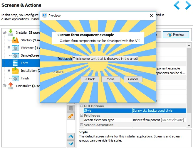
Styles have full preview functionality. While you are editing style components and their properties,
you can preview the result of your configuration with a single click.
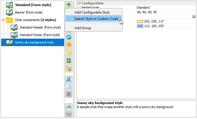
Similar to screens, styles can also be developed with the API. Many new classes have been added in the
com.install4j.api.styles
package to support development of custom styles. The "customCode" sample
project contains a custom style implementation that wraps another user-selectable style and draws
a dynamic background image.
When used for a form screen, the preview shows what the custom style will look like.
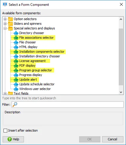
install4j 7 brings many enhancements for form components.
The following new form components have been added:
-
File associations selector: A list of check boxes showing all file association actions that are found
after the current form screen. This was previously handled directly by the "File associations" screen.
-
Installation components selector: Shows a tree of all installation components together with their
descriptions and check boxes for selecting which set of components should be installed. This was previously
part of the "Installation components" screen.
-
License agreement: Displays a license agreement with radio buttons for accepting the agreement. This
was factored out of the "License agreement" screen.
-
PDF display: A cross-platform PDF viewer. Previously, this was only available as a screen.
-
Program group selector: A component to select a program group name for Windows. Previously only available
through the customizable "Program group selection" screen which has now been retired.
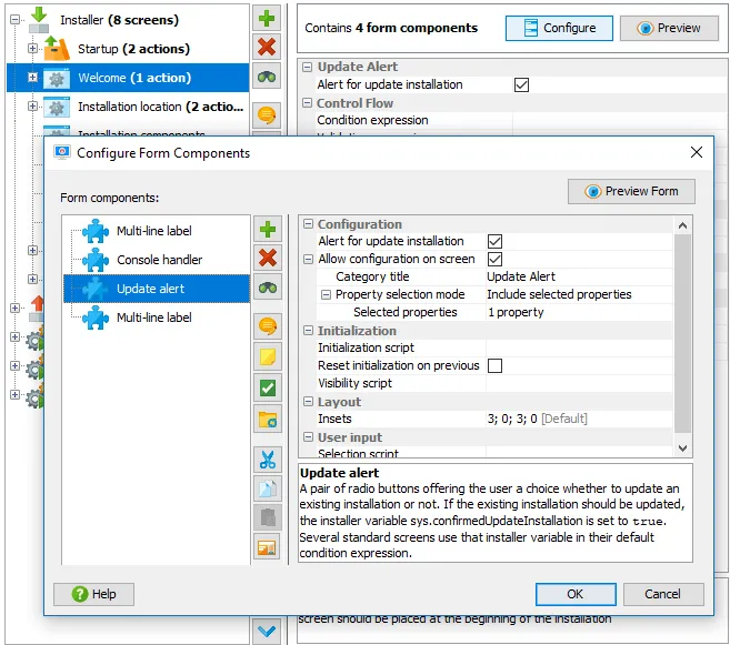
-
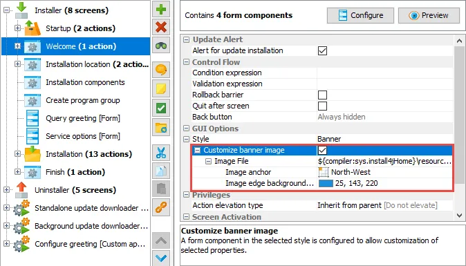
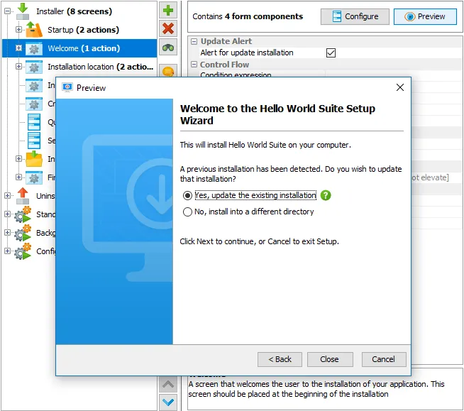
Update alert: A UI component that alerts the user that an update installation can be performed. It
sets the "sys.confirmedUpdateInstallation" installer variable. This functionality was previously contained in
the "Welcome" screen.
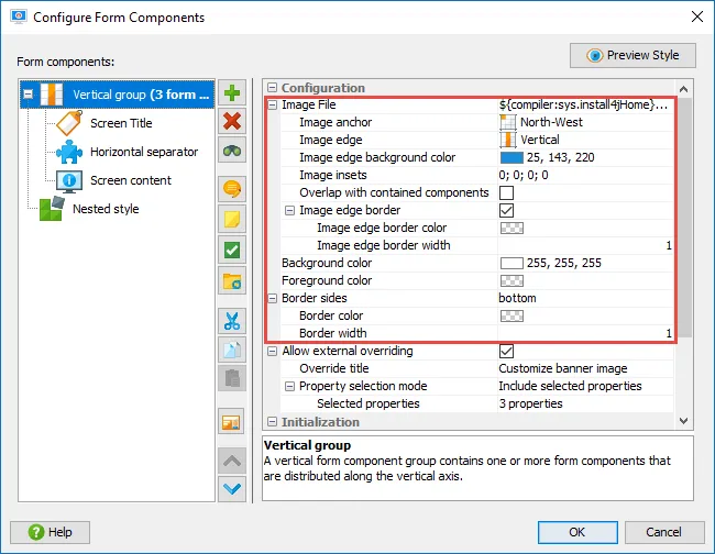
Many new properties have been added for styling layout groups:
-
Image file: An image can be specified to be displayed inside the layout group.
-
Image anchor: The image can be anchored at the center, at the side or at the corners.
-
Image edge: Unless the image is anchored at the center, it cuts off an entire side from the layout group.
If anchored in a corner, you can select whether to cut off a horizontal or a vertical side.
-
Image edge background color: By setting a background color for the image edge, the image can blend
seamlessly into its surroundings. For example, the "Banner" style does this with the default banner image.
-
Image insets: The image can be displayed with specified insets around it.
-
Overlap with contained components: If selected, other form components are layouted on top of the image.
-
Image edge border: A border of variable color and width between the side that is cut-off by the image
and the remaining area of the layout group can be defined.
-
Background and foreground color: Setting a background color will make the layout group opaque, the
foreground color is used by form components that display text.
-
Border sides: Layout groups can have a border on selected sides with a selected border color and width.
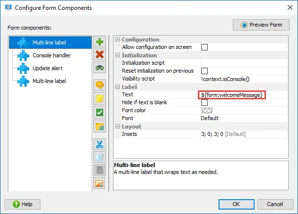
For coordinating between form components or between a containing screen and its form components, a new
variable system has been added that is scoped to the current form. To reference such variables in
text fields, the prefix "form:" is used with the usual variable syntax. New methods have been added to
FormEnvironment
and
AbstractFormComponent
to work with form variables.
For example, the "Welcome" screen now sets a form variable for a header message that is picked up by a multi-line
label in its default form components.
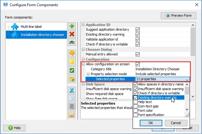
Form components can now export configuration to the containing screen. Each form component has an
"Allow configuration on screen" property. If you select that property, you have to specify a category title
under which the form component configuration will appear in the screen. Also, you can select the properties
that should be exported.
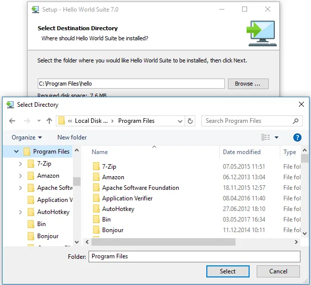
For example, the "Installation directory chooser" form component exports several properties to the containing
"Installation location" screen, so you can quickly access these important properties without searching
for them in the form components.
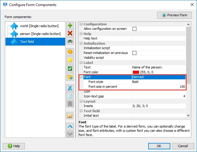
Fonts for many form components can now be set as derived fonts. Previously, an absolute font specification
could be given, which was often impractical. Now, a size and a style change to the default font can be
configured.
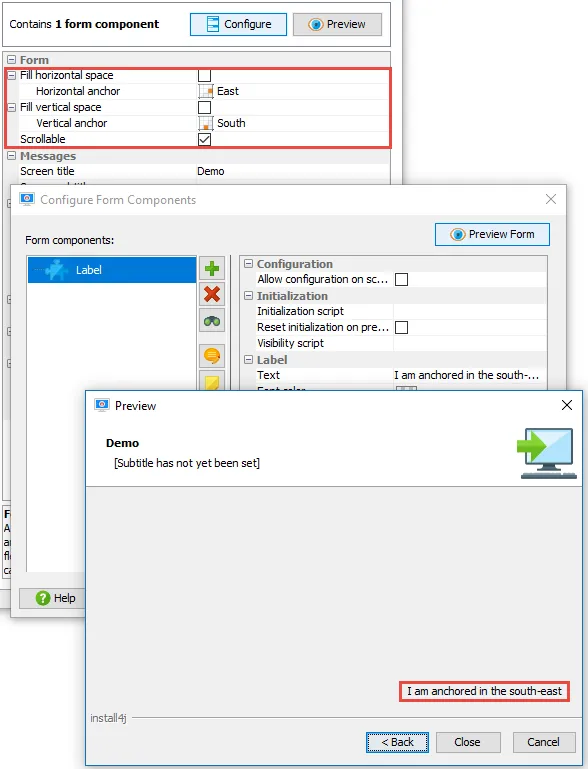
The anchor for the entire form can be configured if the form should not fill the horizontal or vertical
space. If the "Fill horizontal space" or "Fill vertical space" properties of the form are not selected,
child properties are shown to set the anchor along the corresponding axis. The same properties are available
for styles.
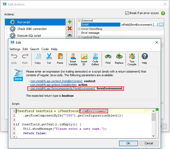
Action lists can now supply fixed parameters for all scripts.
In install4j 6.1, actions lists were introduced. One of their use cases is the "Action list" property of
the "Button" and "Hyperlink action label" form components.
One major usability problem was that there was no way to refer to form components from the configured actions, such
as from a "Run script" action. install4j 7 adds the concept of fixed parameters for all scripts that occur in
action lists and now passes a "formEnvironment" parameter in the above case.
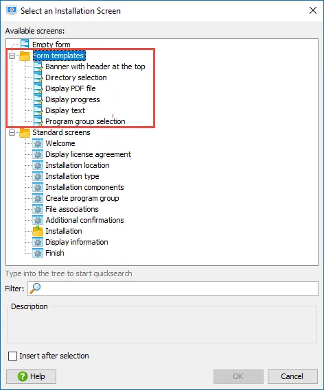
All "customizable screens" have been converted to form templates. The old customizable screens went back
to the early days of install4j when form screens were not yet available. In install4j 7, the new form templates
implement the same screens with form components. Each old customizable screen has been mapped to a form template
and is migrated without any significant change in behavior.
The "Banner with header at the top" form template replaces the "Banner form" screen. Style is now
a separate configuration option and is not coupled to the screen implementation anymore.
The important parameters are exported to the screen configuration, so that these forms are used just like
the old customizable screens. The main difference is that the new form templates can be used as starting points
and can be changed in arbitrary ways.
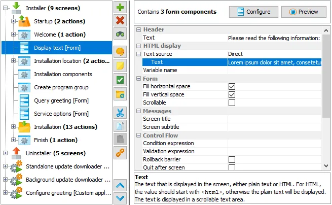
Most standard screens are now built with form components. This means that you can add your own
elements to these screens.
Also, the standard screens with form components get full preview functionality so that you can see what
they look like at design-time.
Native alert boxes and file choosers have been implemented on Windows and macOS.
Previously, cross-platform file choosers and alerts were shown.
Native looking UI elements are important to make the end user feel comfortable with the installer.
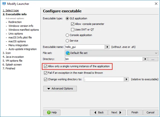
The single instance mode for launchers has been implemented for Linux/Unix launchers.
Previously, single instance mode was only available for Windows and macOS. This feature is now
fully cross-platform.
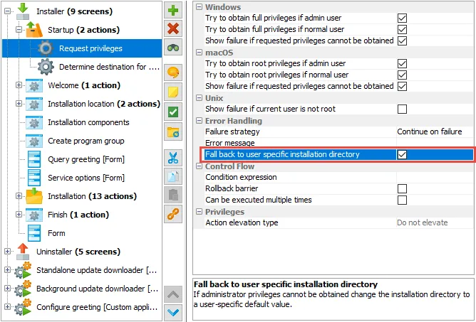
Improved support for installing without admin privileges. installers now automatically handle the case
where there is no "Request privileges" action in the project or where the "Request privileges" action fails
and suggest an installation directory in the user home directory.
If you want to disable this new behavior for a failure of the "Request privileges" action, there is a new
"Fall-back to user-specific installation directory" property for that case.
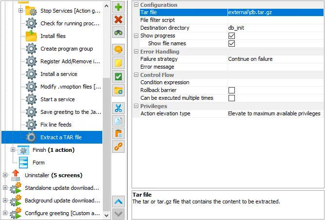
New actions for extracting archives have been added.
On macOS, the "Extract a DMG file" action is useful for obtaining the contents of a DMG file without
manually mounting it.
The "Extract a TAR file" action works on .tar and .tar.gz files, similarly to the "Extract a ZIP file"
action.